BRIEF

I was assigned to a team of three UX designers in a mock project for DESIGNATION. The challenge was to design a responsive microsite for the City of Chicago. The aim of this task was to design an improved experience for accessing local government information and services. In 4 weeks, we performed research, rapid prototyping and usability testing to design a street parking information app for Chicago drivers. In this project, I learned how to structure a research plan to uncover key insights from users.
RESEARCH
The starting point was obvious: we needed to visit the City of Chicago website (city website) to understand what information and services the site currently offered its citizens. We immediately realized that we had opened pandora’s box. There were navigation menus everywhere and we were in IA hell.
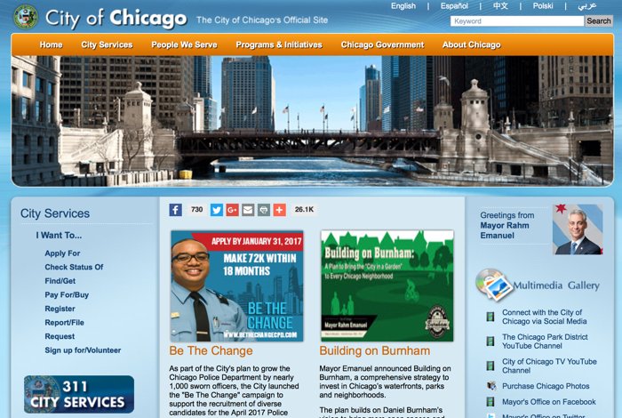
City of Chicago website contained multiple navigation menus.
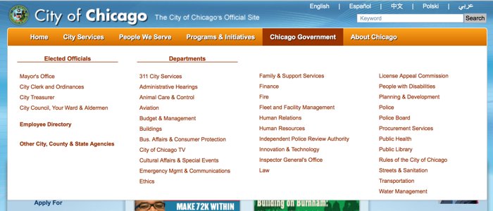
Navigation menus contained sub-navigation menus.
We struggled with the question of how to narrow the scope of this project. I was concerned if we asked only exploratory questions during user interviews, we may not be able to determine the focus of our design. I suggested asking some focused questions during user interviews to identify common patterns. To determine the focused areas of questioning, we sent a survey to Chicago residents to find out what they visited the city website for.
As informed by our survey, we developed interview questions to explore user experiences with tickets, utility bills and job/volunteer opportunities in Chicago. We agreed to revise the scope specific questions based on the results of our initial interviews as necessary.
We started user interviews and expected to hear a wide variety of concerns. To our surprise, many of our interviewees shared similar frustrations with street parking in Chicago:
“ I often receive parking tickets because I don’t know all of the parking rules.” – Pam
We revised our interview script to include more detailed questioning about street parking in Chicago. We also continued to ask general scope questions to allow other insights to arise. We asked the following questions regarding street parking in our revised interview script:
- Do you have a car?
- (If yes) Where do you park your car?
- (If applicable) Please describe the experience of parking on the street.
- Have you had to get a parking permit? How did you go about that?
- Have you had to renew a parking permit? How did you go about that?
SYNTHESIZE
Once user interviews were completed, we captured the insights from each interviewee and began affinity diagramming in order to determine common themes that would guide us to the scope we sought.
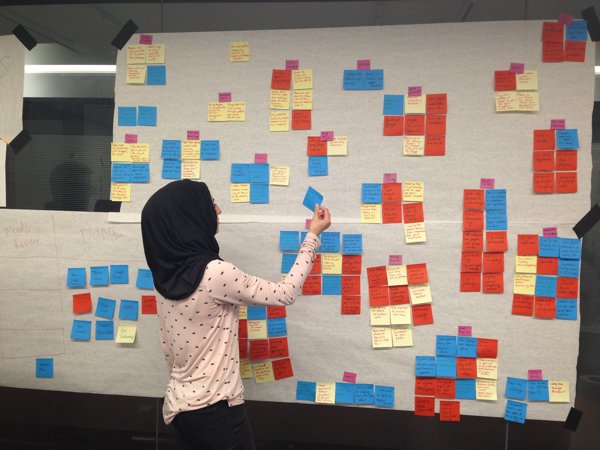
Interviews revealed the acute frustrations of Chicago residents with city parking regulations,
lack of transparency in city government and difficulty navigating the current website.
The exercise confirmed that street parking in Chicago was a major pain point for our users. Common interview insights included the following:
- Chicago drivers receive frequent parking violations.
- Parking rules are ambiguous, inconsistent, and difficult to find.
- Street cleaning rules are frustrating, confusing, and difficult to understand.
- Lack of transparency in parking rules creates mistrust in a government often viewed as being corrupt.
- The city website is difficult to navigate and use on a mobile device
- Chicago residents don’t mind paying for parking fines if they know they were in the wrong.
We broke apart to synthesize the interview insights into a problem statement that would define the scope of our design solution. My problem statement was most successful in setting the stage for the next step:
City of Chicago drivers need a way to access street parking rules in real time. How might we answer the question “Is it safe to park here?
EVALUATE
Although we were given free reign to select the focus of our design, we were wary of producing a ‘pie in the sky’ concept that would not offer value to potential users in a real world scenario. Therefore, we decided to perform an in-depth analysis of competitors already working to address our problem statement.
We discovered that there was an opportunity to develop a more comprehensive
street parking information service than those currently available.
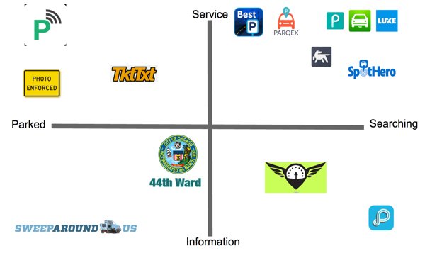
Competitive analysis revealed that there are many websites and apps focused on parking in Chicago. Most of the competitors helped users reserve privately-owned parking spaces. A few competitors provided information on street parking in Chicago including TktTxt, sweeparound, and the 44th ward website.
These information services were limited in their scope, providing scheduled street cleaning and special event parking information within specific geographic areas of the city. We identified an opportunity to develop a street parking information service that would cover a greater geographic area and scope of parking regulations than the services that are currently available.
VERIFY
Now that we established an opportunity to develop a solution to the problem identified, how could we convince the City of Chicago that it is in the city’s best interest to tackle this problem? In order to accomplish this, we performed two tasks:
Task 1) Verified interview insights with quantitative data to prove that ambiguous parking regulations resulted in ticketing of innocent citizens.
One of our interviewees, Jenna, shared legitimate complaints about ambiguous street signage in her neighborhood:
“ Winter parking regulations start today on Dec 1st. If you read the signs quickly it says, ‘No Parking 3 pm to 7 am, snow over 2 inches or after Dec 1st.’ So it doesn’t matter if it snows. 3000 cars probably got towed today” – Jenna
To fact check this information, we collected data from the City of Chicago archives to graph the number of cars towed daily in the city. Graphing this data showed a major increase in the number of cars towed on and shortly after December 1st when winter parking regulations go into effect.
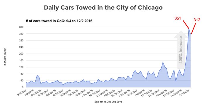
Increase in Chicago towings on the start date of winter parking regulations verifies public unawareness of regulation changes.
Although the number of cars towed on Dec 1st fell short of Jenna’s estimate, it still greatly exceeded the number towed on an average day and verified the claim that ambiguous signage leads to increased parking violations.
Task 2) Demonstrated benefits to the City of Chicago government for implementing a solution.
We conducted further research on parking ticket violations in Chicago and found that Chicago had $1.5 billion dollars in unpaid debt from parking, red light and speed camera violations. That is double the debt of New York City and 6 times that of Los Angeles (Brockway, 2015).

As research revealed that Chicago residents don’t mind paying fines if they’re ticketed fairly, we hypothesized that a portion of the unpaid debt is likely due to unfair ticketing. Therefore, our value proposition to the City of Chicago would be that implementing a solution to the problem we identified would allow citizens to have greater trust in their city government and the city would reap a higher fine collection rate in return.
At this point, we were confident that our research methods had produced a viable project scope. We established the need for a street parking service that would benefit residents and the city. We were brimming with ideas for design solutions at this point. Yet, we took a step back to create guiding assets that would help us maintain empathy with our users while ideating.
EMPATHIZE
We developed two personas and scenarios that we would be solving for.

Naomi P.
A resident who has just parked on the street near her home.
Naomi needs to know how long she has until she has to move her car to another spot to avoid getting a ticket.
Since Naomi is checking how long she has before she needs to move her car after she has already parked. She may attempt to access this information in her car using her mobile phone or from home using her laptop. Naomi will need to access and view any upcoming parking restrictions for the specific location her car is parked in so she can identify when she needs to move her car.
Matteo K.
A suburbanite looking to park to attend a college hockey game at Wrigley Field.
Matteo needs to know where he can legally park within walking distance to Wrigley to avoid getting a ticket.
Matteo is looking for a legal parking spot in an unfamiliar neighbourhood for the duration of the hockey game he is planning to attend. Matteo will need to access this information from his mobile phone. Matteo will need to view locations of parking spots that he can legally park in while he’s at the hockey game so he can navigate to those areas to look for an available spot.
Naomi is asking the question: “can I park here?” While Matteo is asking: “where can I park?” To meet the needs of both of these target users, we decided that the solution must show the user if they can legally park in their current location, as well as inform them of other locations that they can legally park in. Matteo and Naomi need to know if they can legally park with confidence so they can avoid getting a ticket. We developed the following design principles to ensure that our solution would allow Matteo and Naomi to accomplish their goals:

IDEATE
I was excited to ideate potential design solutions to tackle this pervasive problem and explored many divergent concepts. We created concept paper prototypes to test with Chicago residents.
We found that we were able to converge on our concept based on user feedback. Users told us they liked:
- A map showing streets where they can and cannot park.
- Ability to enter their parking duration.
- Parking schedules for a specific spot.
- Personal profile containing permits, parking history, etc.
We created two main task flows for testing with users. For the user like Naomi looking to see if she can park in her local neighborhood we created the “can I park here?” task flow and for users like Matteo who are looking for a place to park in unfamiliar territory we created “where can I park?” task flow.
The creation of these task flows helped us visualize how users like Matteo and Naomi would use this product. When comparing the two task flows, we found that there were quite a few similarities in terms of user actions and inputs. The main difference was the emphasis on the map in the “where can I park?” flow to provide the user with visual feedback of where they can look for parking.
We created revised paper prototypes and uploaded them to Marvel where we incorporated interactions. During user testing we found that users wanted to see a map for both flows. We heard the same words over and over again:
“ I expect this to be more like Uber” – multiple users
Users were looking for map where they could check if they could legally park in their current spot and view other legal parking locations. They expected to see a draggable map with pin like the one they used in Uber to adjust their location. I reviewed Uber, Lyft, Google Maps, iOS Maps, and SpotHero to understand the mental model of our users. Based on my findings, I streamlined the “where can I park?” and “can I park here?” functions by offering a draggable map on the home screen and revised our sitemap in Sketch to reflect these changes.
Challenges that we faced while trying to incorporate the major actions into one map based interface included how to display the location, parking duration and parking regulation information while allowing enough room for navigating the map. I explored several different configurations of displaying this information.
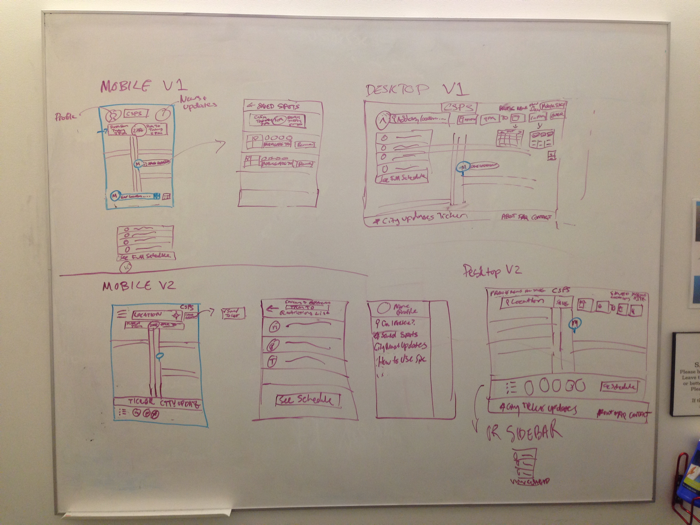
We designed our wireframes in Axure RP and incorporated interactions. I learned how to create a scrolling date and time picker that would emerge when the start or end time was selected by the user.
I also created two variations of regulation display: one with static regulation display on a transparent overlay and another with a hidden menu that would be displayed when the user clicked to view. Armed with our new design, we took our prototype out into the wild for usability testing.
TEST
We tested two versions of the home screen that included the regulation displays that I had developed in Axure RP with users.
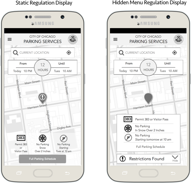
Testing insights:
- Users did not understand the number of hours that represented the parking duration.
- Some users liked the 7 day schedule while other thought it was too much information, they were seeking a 1 day schedule instead.
- Users liked the ability to favorite a parking spot in case they wanted to find it in the future.
- Users did not understand what was meant by “restrictions found” and some did not click to reveal the restrictions.
Users appreciated seeing the parking conditions but felt they needed to do too much reading before they could figure out if they could or could not park in a space. Simply put:
“ Just tell me if I can legally park or not. Yes or No” – Robert
FINALIZE
We created final annotated wireframes and wireflows using Sketch. The final prototype incorporated the following elements based on user feedback during testing rounds:
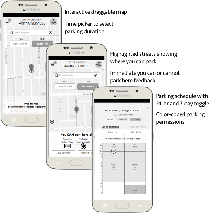
Other features included:
- Personal profile to allow repeat users to save personal details to receive more accurate and personalized information.
- Saved favorite parking spots so users can quickly find areas they parked in before.
- News and alerts from the City of Chicago to allow residents to keep up to date with regulation changes in their area to avoid getting a parking ticket.
MEASURE
Can I Park Here? was presented to a panel of professionals in the design community. One of the designers asked us where we could get the location-specific parking regulation data that would be required for the development of this app. We were prepared for this question and responded that the City of Chicago possesses this data as it is currently used by parking enforcement officers.
Conversations erupted around the room among audience members sharing their own street parking frustrations. The professionals expressed a desire for this product as they had struggled with parking in Chicago themselves and empathized with the question we asked at the culmination of our presentation:
“ Why doesn't this exist yet?"
GUIDE
Our recommendations for next steps to provide users from further protection from ticketing included the following:
- External links to the city website including links to pages on where to get a parking permit and pay for parking tickets so users have easy access to this information to avoid getting tickets or paying additional fines.
- Ability to navigate to saved locations through an external app such as Google Maps or Waze so users can navigate to their legal parking spots directly from the site.
- Notifications related to the user’s parking spot including changes in parking rules such as street cleaning or winter regulations so that users do not forget to move their car before these changes take effect.
REFLECT
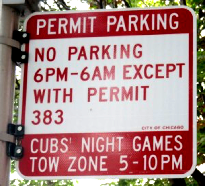
Confusing street parking sign in Chicago.
When we began this project, I was worried about designing without a specific scope. Despite the challenges of this project, I successfully molded our research methods throughout the process in order allow the users to determine the focus of our design solution and in doing so, struck a chord with all Chicago drivers. Every person I have spoken to about Can I Park Here? has responded with deep seated interest and personal horror stories of parking on the streets of Chicago.
I learned how to formulate interview questions to successfully scope a project and continue to use these techniques in subsequent work. By establishing the opportunity and value of our design solution for the City of Chicago, we completed this project with confidence that it could be successfully implemented in the real world.